Choosing the right paint color for each room in a home is more than just an aesthetic decision; it's a science that combines art, psychology, and personal taste. Paint colors have a significant impact on the ambiance and feel of a space, affecting mood, perception, and even behavior. When choosing paint tones, it’s crucial to understand how different colors interact with light and how they can influence the way we experience our surroundings. This article explores the science behind selecting the perfect paint tone for every room in your home.
The Power of Color Psychology
Color psychology is the study of how colors affect human emotions and behavior. Different colors evoke different responses, which is why it’s important to select tones that align with the purpose and mood you want to create in each room. For instance, warm colors like red, orange, and yellow are often associated with energy and warmth, making them great for spaces like kitchens and living rooms where social interaction is encouraged. Conversely, cooler tones like blue, green, and purple are calming and serene, making them ideal for bedrooms and bathrooms where relaxation is key.
Understanding Light’s Role in Color Perception
The way light interacts with a color can greatly impact how it appears on your walls. Natural light, artificial light, and even the direction your room faces can all influence the way a color looks in a room. A paint color that may appear bright and vibrant during the day can look dull under artificial lighting, while darker shades might create a cozy atmosphere during the evening but feel too heavy during the day. Before committing to a color, it’s essential to test how it looks under different lighting conditions to ensure it meets your expectations.
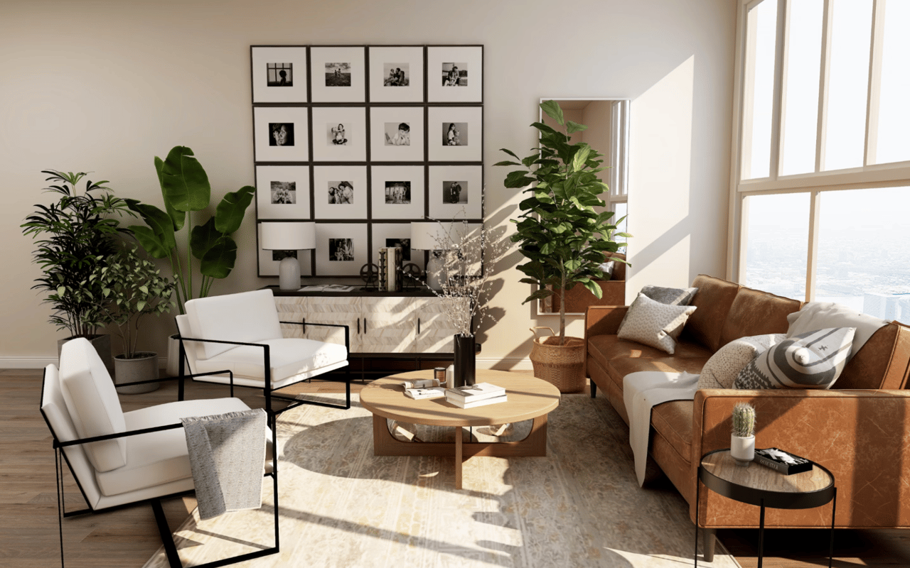
Choosing Colors for the Living Room
The living room is typically the central gathering space in a home, and it’s where first impressions are made. This room benefits from colors that encourage conversation and socializing, making warmer hues like soft oranges, yellows, or neutrals perfect choices. A neutral palette, such as beige, light grey, or off-white, can create a versatile and timeless backdrop for furniture and artwork. However, adding accents of vibrant colors, such as a bold red or deep blue, can inject personality into the room without overwhelming it.
Selecting Bedroom Colors for Restful Sleep
When it comes to choosing colors for the bedroom, the goal is to create a relaxing and restful environment conducive to sleep. Soft, muted tones such as pale blues, greens, and lavender can promote calmness and serenity, making them ideal for bedrooms. These colors are known to reduce stress and anxiety, making them particularly effective in a space dedicated to rest. Darker shades like navy or charcoal grey can also work well, providing a soothing atmosphere that encourages relaxation. Avoid overly bright or intense hues, as they can have the opposite effect and create a sense of restlessness.
Color Selection for Kitchens and Dining Rooms
Kitchens and dining rooms are high-traffic areas where color choices should stimulate appetite and conversation while maintaining functionality. Warm tones like red, orange, and yellow are often used in these spaces because they are known to increase energy levels and appetite. However, it’s important not to go overboard with intense hues, as they can become overwhelming. Instead, opt for softer variations of these colors, such as a warm beige, mustard yellow, or burnt orange, to create a welcoming and vibrant atmosphere. Additionally, neutral tones, such as white, light grey, and natural wood finishes, work well in these rooms and allow for versatility in decor.
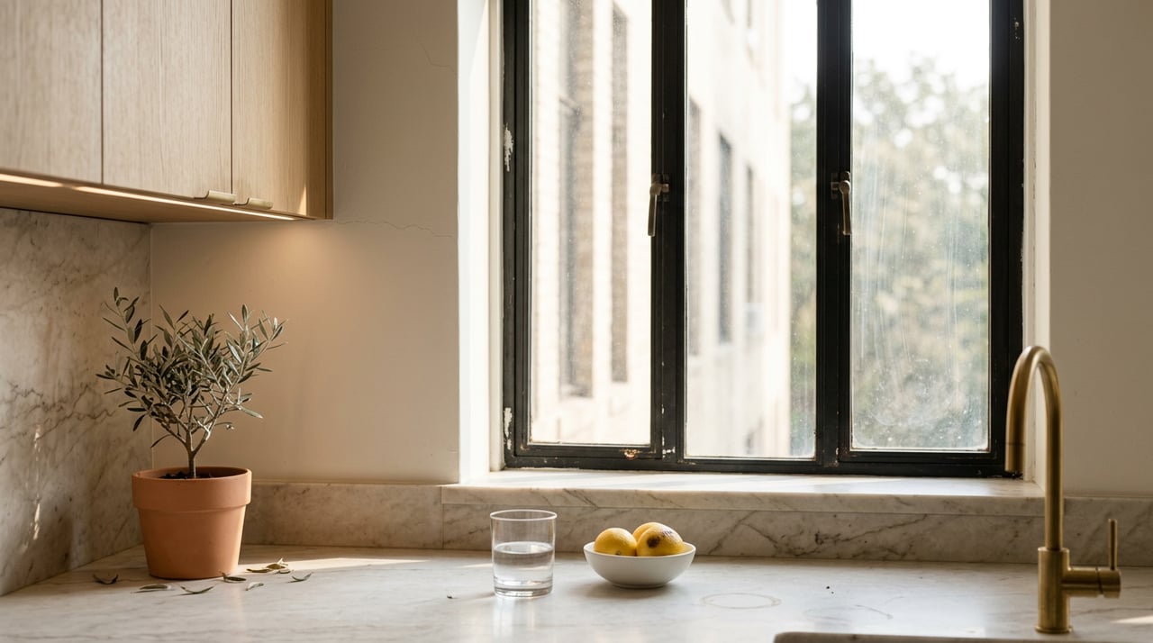
Creating a Calm and Inviting Bathroom
Bathrooms are typically smaller spaces where color choices can have a big impact on creating a sense of tranquility and cleanliness. Light blues, soft greens, and seafoam shades can evoke a spa-like atmosphere, making them ideal for bathrooms where relaxation is key. White and light grey tones are also excellent choices for a clean, fresh look. For a touch of elegance, consider incorporating shades of marble or stone, as they are both timeless and soothing. Avoid dark, heavy colors in small bathrooms, as they can make the space feel more cramped and less inviting.
Colors for Home Offices and Study Areas
The color choices for home offices and study areas should enhance focus and productivity. Soft, neutral tones such as light grey, beige, or off-white can create a clean and uncluttered environment conducive to concentration. If you prefer a bit more energy in the room, consider adding accents of blue or green, as these colors are known to boost focus and creativity. Avoid overly stimulating colors like bright red or orange in a home office, as they can be distracting and lead to feelings of agitation. Instead, opt for calming tones that help maintain mental clarity throughout the day.
The Impact of Accent Walls and Trim
Accent walls and trim can be an excellent way to introduce bold colors without overwhelming an entire room. Accent walls allow you to experiment with colors you love, such as deep blue, forest green, or rich burgundy, without making them dominate the space. These colors can add drama, interest, and dimension to a room. When choosing trim colors, white, off-white, or deep tones like charcoal or black can create contrast and highlight architectural features. Trim colors should complement the wall color, enhancing the overall aesthetic of the room without competing with the primary hue.
Trends in Paint Tones for 2025
Biophilic design is shaping 2025 interior trends by bringing the calming essence of nature indoors. This approach focuses on natural elements, organic textures, and earthy color palettes to create a harmonious living environment that enhances well-being, relaxation, and a deeper connection to nature. Accent colors may shift towards muted shades of blue, teal, and mustard, offering a modern twist on classic tones while reinforcing the serenity and grounding effects that nature-inspired spaces provide.
Using Color to Enhance Your Home
Choosing the right paint tones for every room in your home is an art that involves both scientific understanding and personal preference. From the calming blues of the bedroom to the vibrant tones of the living room, each room has its own personality and purpose that can be accentuated with the right color palette. Understanding how light, psychology, and trends play into your decision-making process will help you create a harmonious and functional home environment.
Ready to Transform Your Space?
Color choices are a powerful tool in creating the home of your dreams. Whether you’re looking to refresh a single room or undertake a full renovation, Bianca D'Alessio can help you navigate the world of home design. With expert guidance and a deep understanding of Manhattan real estate, you can find the perfect hues that complement your lifestyle and aesthetic. Get started today with professional advice tailored to your vision!